Table of Contents
ToggleTo help you out, I’ve put together a list of 15 website design best practices, complete with tips and examples. Use this checklist to make sure your site is up to par—and start driving more leads and conversions for your business.
15 Best Practices for Website Design Checlist:
01. Make sure your site is mobile-friendly
Mobile-friendliness isn’t just a nice-to-have—it’s now a ranking factor for Google. With more people than ever accessing the internet on their smartphones and tablets, your website must be designed to accommodate them. If your site isn’t optimized for mobile devices, you could be losing out on valuable traffic.
There are a few things you can do to make sure your site is mobile-friendly:
- Use responsive design: Responsive design means that your website will automatically adjust to whatever device it’s being viewed on, whether a smartphone, tablet, or desktop computer. Google recommends using responsive design to ” eliminate the need for a separate mobile website.”
- Keep your content short and sweet: When people view your website on a smaller screen, they don’t want to scroll through long blocks of text. Keep your content concise and easy to scan, using headlines, bullet points, and short paragraphs.
- Make sure your buttons and links are big enough to tap: It can be frustrating for mobile users if they have to zoom in to click on a button or link. Make sure your buttons and links are big enough to be easily tapped, even on a small screen.
02. Use clear calls to action.
Your call to action (CTA) is what you want people to do when visiting your website. Whether that’s signing up for your email list, downloading a piece of content, or making a purchase, your CTA should be prominently displayed and easy to find.
Add these to your checklist to make sure your CTA is compelling:
- Use actionable language: Your CTA should be written in language that urges people to take action. For example, instead of saying “Sign up for our newsletter,” you could say, “Get the latest news and offers by subscribing to our newsletter.”
- Make it visible: Your CTA shouldn’t be buried at the bottom of your website or hidden away in a menu. It should be easy to spot, whether that means using a contrasting color or making it more prominent than the surrounding text.
- Use whitespace: Again, you want to make sure your CTA stands out from the rest of your website. Using whitespace—blank space surrounding your CTA—is an effective way to do this.
03. Use easy-to-read fonts
The fonts you use on your website can impact how easy it is for people to read your content. When choosing fonts, you’ll want to make sure they’re easy to read, even on a small screen. And while it can be tempting to get creative with your font choices, resist the urge to use anything too fancy or difficult to read.
Consider keeping these in mind when you choose fonts for your website:
- Stick to a maximum of two fonts: Using more than two fonts can make your website look cluttered and messy. Please stick to one or two fonts, and use them throughout your website for consistency.
- Use sans serif fonts: Sans serif fonts—fonts without the “feet” at the end of each letter—are generally easier to read than serif fonts. If you’re unsure which fonts to use, start with a sans serif font like Arial. Then, experiment with adding a serif font for headlines or other important text.
- Avoid using script fonts: Script fonts can be challenging to read, so they’re best used sparingly, if at all. If you want to use a script font, make sure it’s paired with a more easily readable font.
04. Use color and contrast wisely.
The colors you use on your website can significantly impact how easy it is for people to read your content. When choosing colors, you’ll want to make sure they create enough contrast to be easily readable. That means avoiding using light text on a dark background or vice versa.
A few things to keep in mind when choosing colors for your website:
- Use a light background: A light background—such as white, cream, or light gray—will make your text easier to read.
- Use dark text: Dark text—such as black, dark gray, or navy blue—will stand out against a light background.
- Use high contrast colors: High contrast colors—such as orange and blue or black and white—will also make your text easier to read.
- Use color wisely: In addition to using colors that create enough contrast, you’ll also want to use color wisely. That means using colors that complement each other and don’t clash.
05. Consider using a grid system.
A grid system is a way of organizing your content so that it’s easy to read and easy to navigate. Grid systems are beneficial if you have a lot of content on your website.
There are a few things you can do to make sure your grid system is effective:
- Use a simple, clean layout: A simple, clean layout will make your content easier to read and navigate.
- Use whitespace: Whitespace can help break up your content and make it easier to read.
- Use a consistent layout: A consistent layout will help people find what they’re looking for on your website.
06. Make sure your website is responsive.
A responsive website is a website that looks good on all devices—desktops, laptops, tablets, and smartphones. Responsive design is essential because it ensures that your website will look good no matter how people view it.
There are a few things you can do to make sure your website is responsive:
- Use responsive design: Responsive design is a way of designing websites so that they look good on all devices.
- Use media queries: Media queries are a way of targeting different styles to different devices.
- Use fluid layouts: Fluid layouts are a way of making sure your content resizes itself to fit the width of the device it’s being viewed on.
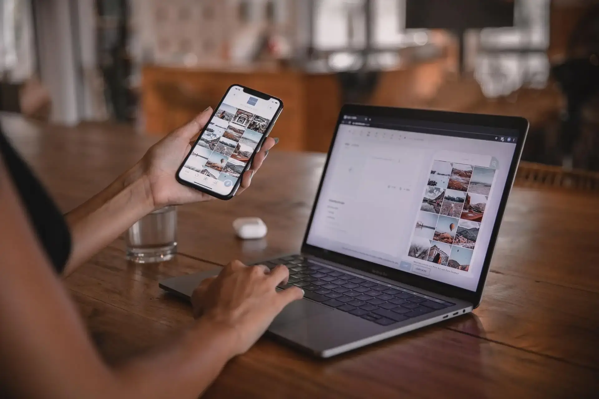
07. Use images wisely
Images can help make your website more visually appealing, but they can also make it slower to load and more difficult to navigate. When using images on your website, you’ll want to make sure they’re optimized for the web.
There are a few things you can do to optimize your images for the web:
- Use smaller files: Smaller files will load faster.
- Use the suitable file format: The suitable file format—such as JPEG, GIF, PNG, or Webp—will also help your images load faster.
- Use alt tags: Alt tags add text to your images so that search engines can read them.
08. Use fonts wisely
In addition to using the right colors and contrasts, you’ll also want to use the correct fonts. The right fonts will make your website easier to read and navigate.
To make sure you choose the right fonts for your website, follow these guidelines:
- Use sans serif fonts: Sans serif fonts—such as Arial, Helvetica, or Verdana—are easier to read on the web.
- Use a limited number of fonts: Using a limited number of fonts will help ensure that your website is easy to read.
- Use font sizes that are easy to read: Font sizes that are easy to read—such as 12px or 14px—will also help ensure that your website is easy to read.
09. Use navigation wisely
Your website’s navigation should be easy to use and easy to understand. That means using clear, descriptive labels for your links and organizing your content in a way that makes sense.
There are a few things you can do to make sure your website’s navigation is effective:
- Use clear, descriptive labels: Clear, descriptive labels will help people understand where they are on your website and what they can expect to find there.
- Use simple, easy-to-understand navigation: A simple, easy-to-understand navigation will help people find what they’re looking for on your website.
- Use breadcrumbs: Breadcrumbs show people where they are on your website and how they got there.
10. Use CTAs wisely
CTAs, or calls to action, are a way of getting people to do something on your website. They can be used to get people to sign up for your newsletter, buy your product, or read your blog post.
There are a few things you can do to make sure your CTAs are effective:
- Use actionable language: Actionable language is the language that tells people what they need to do. For example, “Sign up for our newsletter” or “Buy our product.”
- Use persuasive language: Persuasive language is the language that convinces people to do something. For example, “Our product is the best on the market” or “Our newsletter is essential reading.”
- Use a CTA button: A CTA button is a button that allows people to take action on your website. For example, a “Sign up” button or a “Buy” button.
11. Use social media wisely.
Social media is a great way to connect with your audience and promote your website. But it’s essential to use social media wisely. That means using social media to post interesting and informative content and interact with your audience.
There are a few things you can do to make sure you’re using social media wisely:
- Use social media to post interesting and informative content: Interesting and informative content will help you connect with your audience and promote your website.
- Use social media to interact with your audience: Interacting with your audience on social media is a great way to build relationships and promote your website.
- Use social media to promote your website: Promoting your website on social media is a great way to get people to visit your website.
12. Use easy to load images.
Images are a great way to add visual interest to your website. But they can also slow down your website if they’re not optimized for the web.
There are a few things you can do to make sure your images are easy to load:
- Use image compression: Image compression is a way of reducing the file size of your images without reducing the quality.
- Use alt text: Alt text is a way of describing your images to people who can’t see them. It’s also a way of helping search engines understand your images.
- Use responsive images: Responsive images are images that adjust their size to fit the device they’re being viewed on.
13. Provide everything “above the fold.”
The term “above the fold” refers to the area of your website that people can see without scrolling. It’s important to provide everything “above the fold” because people are more likely to stay on your website if they can see what they want without scrolling.
There are a few things you can do to make sure everything is “above the fold”:
- Use a hero image: A hero image is a large image that’s placed at the top of your website. It should be relevant to the rest of your website’s content.
- Use headlines and subheadings: Headlines and subheadings are a way of breaking up your content and making it easy to scan.
- Use whitespace: Whitespace is the space between your content. It’s making your content easier to read and giving your website a more spacious feel.
14. Provide clear and concise content
Content is the most crucial part of your website. It’s what people come to your website to read. And it’s what helps you connect with your audience.
Clear content is easy to understand. That’s why it’s essential to make sure your content is clear and concise. Concise content is free of unnecessary words and phrases.
There are a few things you can do to make sure your content is clear and concise:
- Use short sentences: Short sentences are easier to read and understand.
- Use simple words and phrases: Simple words and phrases are easier to read and understand.
- Use active voice: Active voice is easier to read and understand.
- Use lists: Lists are a great way to break up your content and make it easy to scan.
15. Link where needed
Linking is a great way to help people navigate your website and find the information they’re looking for. But it’s important to use links wisely. That means only linking to websites and pages relevant to your audience.
To effectively use the links where needed, follow these guidelines:
- Use text links: Text links are a great way to help people navigate your website.
- Use navigation menus: Navigation menus are a great way to help people find the information they’re looking for.
- Use breadcrumbs: Breadcrumbs are a great way to help people track where they are on your website.
Conclusion
When designing a website, it’s essential to keep your audience in mind. What do they want to see? What do they need to know?
Answering these questions will help you determine what should be included in your website design checklist. Use this checklist as a guide to help you create a user-friendly, easy to navigate, and informative website.
If you need a website designer, please contact me for a free consultation. I’m always happy to help anyone who needs a beautiful and functional website.
FAQs
What are the steps for website design?
The steps for website design include planning, research, wireframing, designing, testing, and launching.
What are the 7 steps in the design process?
The seven steps in the design process are planning, research, analysis, ideation, development, testing, and launch.
What are the 4 stages of web design?
The four stages of web design are planning, designing, development, and launch.
What are the 8 steps in website planning?
The eight steps in website planning are research, wireframing, sitemap creation, content writing, design, development, testing, and launch.